How to Use inkFrog Designer Templates
Welcome to inkFrog Designer, where creating eye-catching eBay listing templates is as fun as it is easy! Here’s everything you need to know to get started.
Templates Made Simple
With inkFrog, templates are completely separate from your listings. What does that mean for you? It’s super easy to switch between different templates or even change to another listing provider without a hassle. Whether you’re a template rookie or a design pro, you’ll love how simple and flexible this feature is!
With inkFrog, templates are completely separate from your listings. What does that mean for you? It’s super easy to switch between different templates or even change to another listing provider without a hassle. Whether you’re a template rookie or a design pro, you’ll love how simple and flexible this feature is!
Design Made for You
Our Designer tool is powered by a WYSIWYG (What You See Is What You Get) editor, meaning no HTML experience required. It’s intuitive and easy to navigate once you’ve played around a bit. You’ll be creating stunning eBay templates in no time—even if the last time you saw HTML was a mystery!
Our Designer tool is powered by a WYSIWYG (What You See Is What You Get) editor, meaning no HTML experience required. It’s intuitive and easy to navigate once you’ve played around a bit. You’ll be creating stunning eBay templates in no time—even if the last time you saw HTML was a mystery!
New Features That Wow
- YouTube Video Integration: You asked, we delivered! Now you can embed YouTube videos directly into your eBay listings. Show off your products in action!
- Cross Sell Widget: Boost your sales by showcasing other items you’re selling right within your listings. It’s like having a mini store right there on each page!
Ready-Made Templates for Instant Success
Feeling short on time? No worries! We’ve got hundreds of professionally-designed templates ready to go. Just log in to inkFrog, head to the Designer tool, pick your favorite template, and boom—you’re ready to roll. You’ll be up and running in minutes!
Feeling short on time? No worries! We’ve got hundreds of professionally-designed templates ready to go. Just log in to inkFrog, head to the Designer tool, pick your favorite template, and boom—you’re ready to roll. You’ll be up and running in minutes!
Let’s Get You Started!
Because inkFrog Designer is a powerful tool, it might seem a bit complex at first. But don’t stress! We’ve put together a guide to help you master the Designer like a pro—and watch your sales skyrocket!
Because inkFrog Designer is a powerful tool, it might seem a bit complex at first. But don’t stress! We’ve put together a guide to help you master the Designer like a pro—and watch your sales skyrocket!
How Templates Work
It’s the framework that holds everything together. When you use it correctly, all your listings will have the same “look and feel,” but each item can be customized to fit your needs.
Templates save you tons of time by letting you add consistent content across all your listings, from your logo to your return policy. Need to add shipping details or promotional offers? No problem. With templates, it’s a breeze.
Why Templates Are Your New Best Friend
A template isn’t just for looks—it’s a sales tool! With a solid template, you can include special promotions or direct customers to your eBay store. The more they browse, the more likely they are to buy from you!
Ready to Get Started? Here’s How to Access the Designer Tool
To start using the Designer tool:
- In inkFrog Open, click on eBay > Templates.
- Then, click Create New Template in the top-right corner.
- Select Designer Template from the popup window and start creating!
It’s that easy!
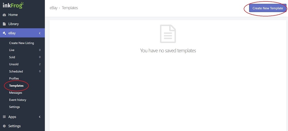
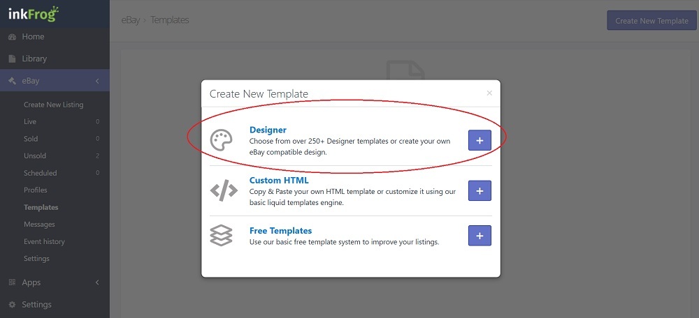
It will show you hundreds of professionally designed templates (available to you if you're on the Designer subscription plan), and it also unlocks the template builder, where you can unleash your creativity and design your very own custom template!
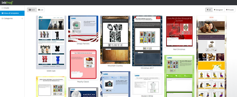
Using an Existing Template
Want to use one of our pre-built templates? No problem! Here’s how you can easily make it your own and start selling:
- Go to the Designer Template Tool (http://builder.inkfrog.com).
- Browse the templates and pick the one that catches your eye.
- Click Edit to load the template.
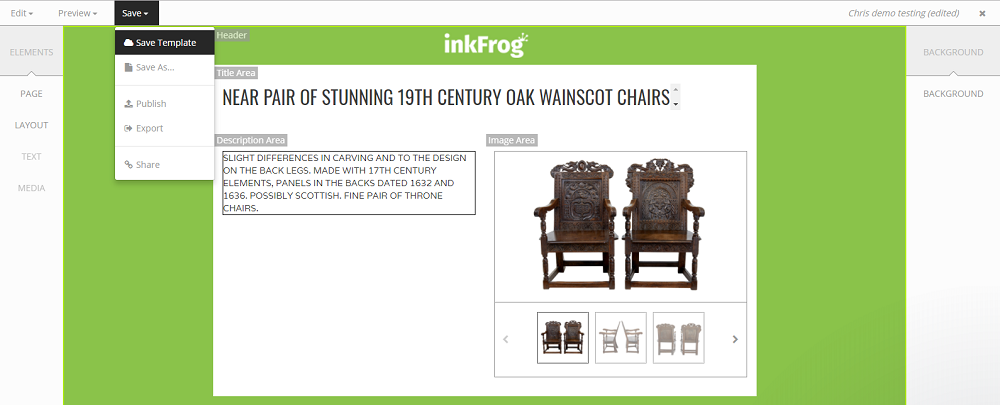
- Hit Save > Save As to create a copy and save it to your account.
- Make any tweaks or changes you’d like to personalize it.
- Once you’re happy with your design, click Save > Save Template to lock in your changes.
- Head back to inkFrog Open and assign the template to your listings.
Let’s walk through an example:
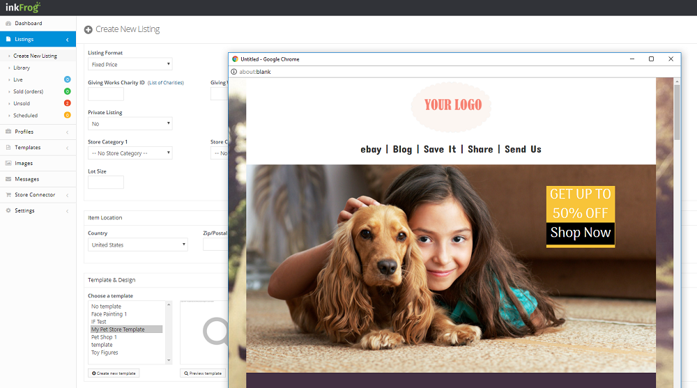
I want to sell pet supplies, so I’ll head to the Designer Template tool. On the left menu, I’ll click on the Pet Supplies category... and from there, I’ll choose the perfect template for my listings!
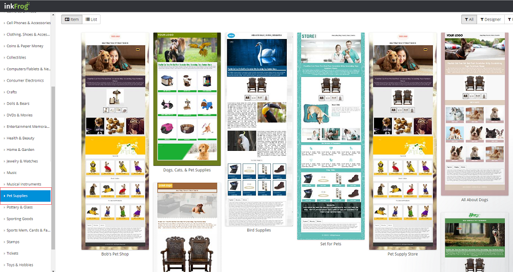
I find this really adorable template which I think would be perfect for my pet supplies. It has cute pet icons, a fun layout, and vibrant colors—exactly the vibe I want for my shop. Here’s what I’ll do next:
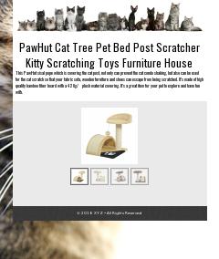
Click here to open this template in a new window
I click on the template to open the full-size preview, and wow, it looks even better up close! The layout is perfect for showcasing my pet supplies, with large, eye-catching images and clear sections for product details, pricing, and more. I can already picture how great my listings will look using this template!
I click on the template to open the full-size preview, and wow, it looks even better up close! The layout is perfect for showcasing my pet supplies, with large, eye-catching images and clear sections for product details, pricing, and more. I can already picture how great my listings will look using this template!
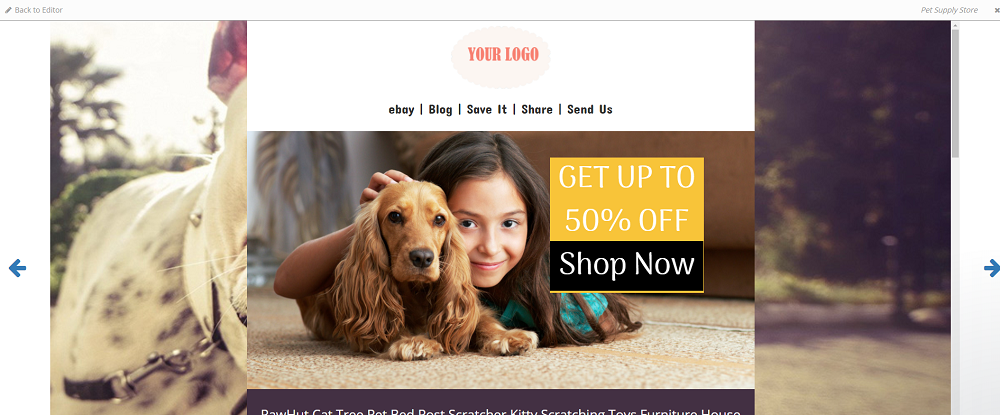
I edit the template by clicking on "Back to Editor", which takes me back to the design workspace. Here, I can start customizing it to fit my store’s needs. I add my logo at the top, tweak the colors to match my brand, and update the text to highlight promotions for my pet supplies. The editor is super easy to navigate, so I’m able to make these changes quickly and effortlessly.

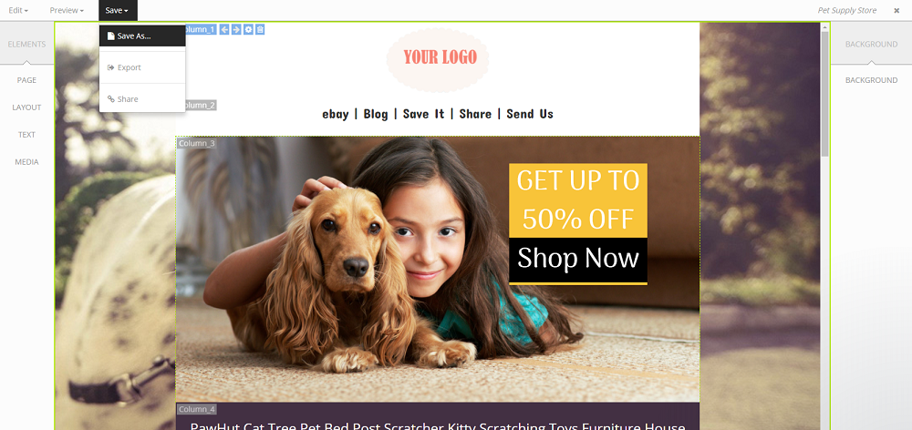
I then click on Save > Save As to create a copy of the template and save it to my account. This way, I can keep the original template intact while having my personalized version ready for use. Now, I’ve got my very own customized template saved, and I can make further adjustments if needed before applying it to my listings!
I give it a name, something like "Adorable Pet Supplies Template," and save it to the Pet Supplies folder on my account. This keeps everything organized and easy to find later when I’m working on my pet supplies listings. Now it’s ready to go!
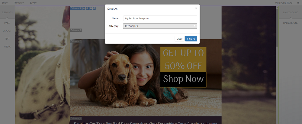
Now that this template has been copied to my account, I can make further changes to it (check out the section below on how to edit templates), or I can start using it right away. The template now appears in inkFrog Open whenever I’m creating or editing a listing. I just go to the template selector option, and voilà! I can easily apply my newly customized template to my pet supplies listings.
It has now been published to my account! I go back to my inkFrog Open account and decide I want to immediately list it with some products. So, I head into the Listings section, select the 2 listings I want to apply the template to, and then bulk edit them. I choose my newly saved template from the dropdown, hit Save, and just like that, my pet supplies listings are looking polished and professional with the new template applied!
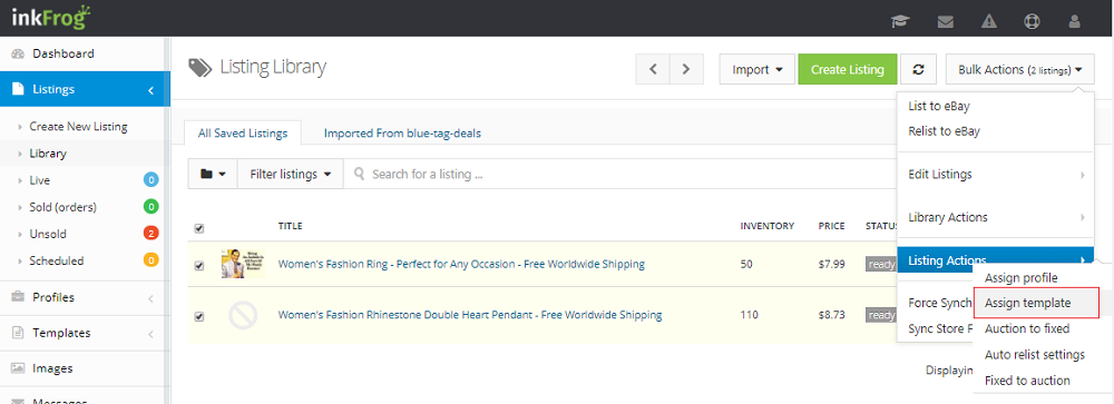
Those listings will now use that template moving forward, giving them a fresh, cohesive look that’s sure to attract more attention! With the new template, they’ll definitely stand out and look much more professional, helping to boost my brand’s presence on eBay. Time to watch those sales grow!
Creating a New Template From Scratch
Let’s say that, for whatever reason, the hundreds of pre-built templates just aren’t your style, and you’ve got a vision for how you want your template to look. No problem! You can create your own template from scratch.
Just head back to the Designer Template section (http://builder.inkfrog.com) and click on Create.

This will pop open a little window asking you to select the template type (currently, there’s only one type to choose from, so just select that). Next, it will ask you for some details like the template name and category. Fill those out, and you’ll be all set to start building your custom template from scratch!

Once that’s done, you’ll be taken to the Editor tool, where a very basic template will appear. This blank slate is your canvas, and from here, you can start adding all the elements that will make your template uniquely yours!

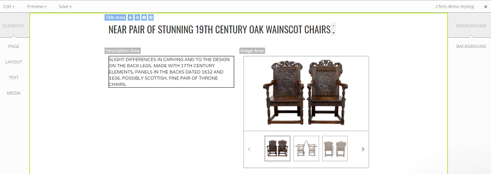
Now, a few important things to note—what you see in the editor (the title, description, and pictures) are just placeholders. They look the same for everyone, so don't worry if they seem generic. When you publish the template with an actual listing, these fields will automatically be replaced with your real product data.
With your basic template in hand, it's time to roll up your sleeves and start editing! Get ready to make your template look fancy and fit your unique style.
Editing a Template
Before you dive into editing your template, it's important to understand the three menus you'll be working with:
- Top Menu: This controls basic functions like Save, Undo, and other options you'd typically find in a word processor.
- Left Menu: This manages the general layout (called Elements) of the page. You can create new sections of content and move them around here.
- Right Menu: This handles the fine details like colors, fonts, and specific adjustments for each element on the page.
Example:
Let’s say you want to add your logo to the top of a new template.
- In the left menu, select Media > Image. It will prompt you to either upload an image or provide a link to one.
- Once you upload your logo, it will appear in your template. You can click and drag it to position it where you want.
- If you want to make the image bigger, link it, or adjust other settings, just click on the image and use the right menu to access fine-tune controls.
Making Basic Modifications:
Now, let’s make some simple changes to the default template to make it more presentable. We'll add:
- Some color to the background or sections
- Our logo at the top
- Other basic tweaks to make everything pop!
Here’s our starting point: a basic, clean template ready for your custom touch!
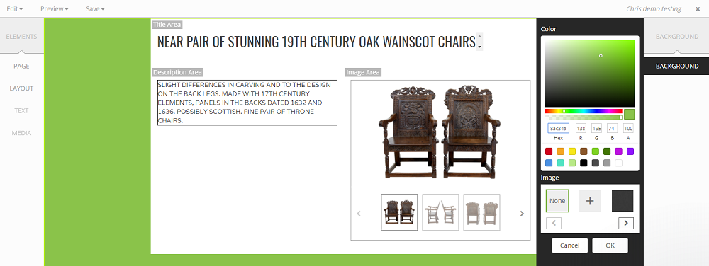
First, we’re going to make the background inkFrog green to match our brand! Here’s how:
- In the left menu, select Elements > Page > Background. This selects the background of the entire template.
- Then, in the right menu, choose Background, which will open up the controls for adjusting the background.
- Enter the inkFrog green color code (or choose it from the color picker), and voilà! The background will instantly update to the inkFrog green color in the preview panel.
Now, our template is already starting to take shape with a bold, branded look!
Now we want to add a header to showcase our logo. There are a few ways to do this, but the easiest way is to simply add a row and move it above the other rows in the template.
Here’s how we do it:
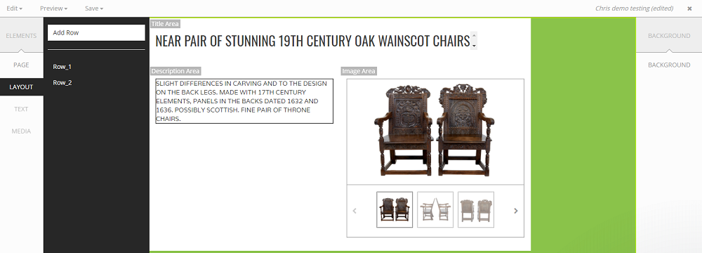
- In the left menu, select Elements > Layout > Add Row.
- This will add a new row to your template.
- You can now drag this row to the top of your template, positioning it right above the other content rows.
Now you’ve got a dedicated space at the top to place your logo and make your header stand out!
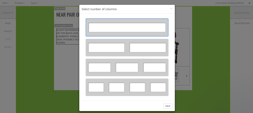
It will open a little window asking you to specify the type of row and give it a name. To keep things organized, we’re going to call this row "Header" so it's easy to identify later. We’ll also set it to be a single column row since our logo will go there.
Once you’ve named it and selected the single column option, click Save—and now you’ve got a header row ready to hold your logo!
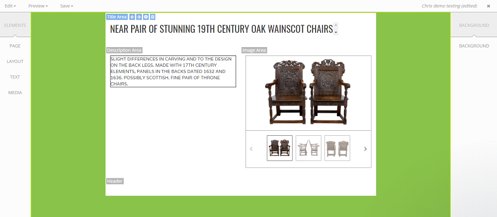
Great! We’ve added a row to the template called Header, but by default, it gets added underneath the other rows.
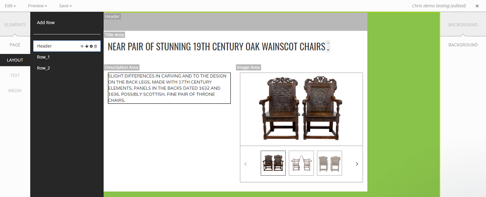
So, we need to move the row to the top. Moving a row is very easy:
- In the left menu, under Elements, select Layout.
- Hover your mouse over the Header row you want to move. A few buttons will appear beside it, and the row will be shaded in gray in the preview panel, so you can see exactly what you’re touching.
- Simply click the little up arrow a few times to move the row to the top of the template.
Now, your Header row will be at the top, and your logo will be prominently displayed!
Now, let’s add our logo to the header!
To do this:
- Click on the Header row in the preview panel. The name of the row will light up in blue when it's selected.
- In the left menu, select Media > Image. This will open a little window asking you for some specifics about the image.
- You’ll be prompted to either upload an image from your computer or provide a link to your logo.
Once you’ve selected your logo, it will be dropped into the Header row, ready for you to position and adjust as needed!
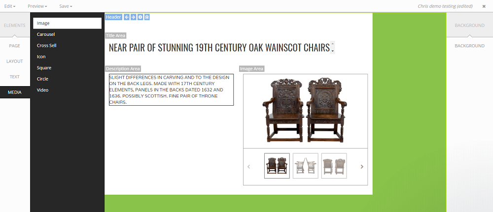
Uh-oh! Looks like we’ve hit a little snag—the image we selected has white text on a transparent background. This can be tricky because it may not stand out against the white or light-colored background of our template.
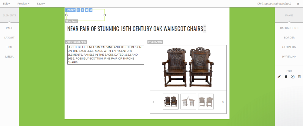
Since the logo with white text on a transparent background isn’t working well for us, we can change the background behind the logo to make it stand out better. We’ll match the background color to inkFrog green for a consistent look across the template.
Here’s how to change the background color of the row:
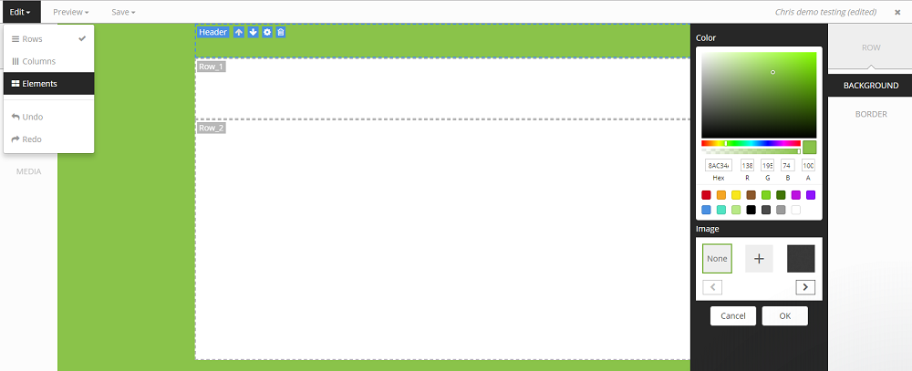
- First, switch to Row editing mode by clicking Edit > Rows. This will allow you to modify the row's background.
- By default, the template designer works in Elements mode, which lets you edit individual elements like images and text. To modify the background of the row, we need to switch to the Row editing mode.
- Once you’re in Row mode, in the right menu, you can select the Background option and choose inkFrog green (or the color you want) for the row background.
This will give your logo a bold, contrasting backdrop, making it stand out nicely against the rest of your template!
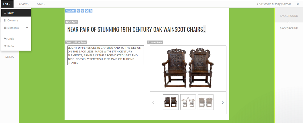
Once we’re in Row Editor mode, we’ll only see the rows and the template background—everything else will be hidden so we can focus on the rows.
Here’s how we update the background color of the row:
- Select the row we want to update (in this case, the Header row).
- In the right menu, select Background just like before.
- Enter the inkFrog green color code (or your chosen color) to apply it as the background.
This will change the entire row’s background to the color we’ve selected, making our logo stand out beautifully with that bold green backdrop!
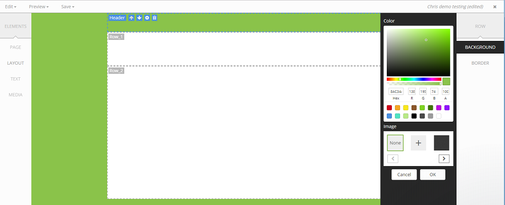
Now that we've set the background color for the row, we need to switch back to Element Mode to see everything else on the template.
Here's how:
- Click Edit > Elements to switch back to Element Mode.
- This will bring everything else back into view, including your logo, text, and other elements on the page.
Now you can continue making any other edits or adjustments you need, all while keeping the layout looking great!
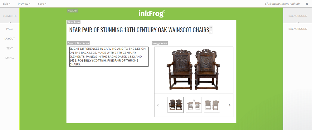
Awesome! Now that we're back in Element Mode, we can see how the background color change looks. The inkFrog green background behind your logo should make it pop nicely and create a clean, professional look!
Before we move on, let’s save the template to avoid losing any progress. It’s always a good idea to save your work often, especially in case something unexpected happens (like a forced restart or a computer hiccup).
Here’s how:
- Click Save in the top menu.
- If you haven’t already, give your template a name and save it to your account.
By saving frequently, you’ll ensure that all the changes you’ve made up until now are safely stored. Now we’re ready to keep moving forward!
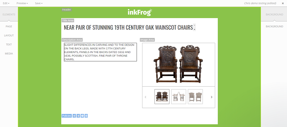
Let's add a Policies row to clearly display shipping, returns, and other important details on every listing.
Here’s how to do it:
- In the left menu, go to Elements > Layout and select Add Row just like we did for the Header row.
- When the window pops up, name the row Policies to keep things organized, and set it as a single-column row.
- Click Save to add the row to the template.
Now we have our Policies row added! We can move it into position (maybe below the product details or wherever you prefer) and start adding content like shipping and return policies.
Ready to go?
Now that we’ve created the Policies row, let’s make it interactive and organized by adding Tabs! This will allow you to display different blocks of text (like shipping, returns, and other policies) that customers can cycle through by clicking on the tabs.
Here’s how to add the Tabs widget:
- In the left menu, go to Text > Tabs.
- This will add a Tabs element to the row, which will let you create multiple sections of content that users can toggle between.
You can now start adding your Shipping, Returns, and other policy details to each tab!
Ready to customize?
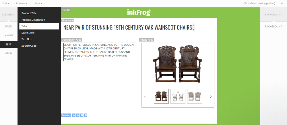
When you select the Tabs widget, a little window will pop up asking you for how many tabs you want to create and what each one should be called.
In this example, we’ll use the default 3 tabs. You can rename them to something more meaningful for your policies, such as:
- Shipping
- Returns
- Contact Us
This will give your customers an easy way to navigate through your important policy information.
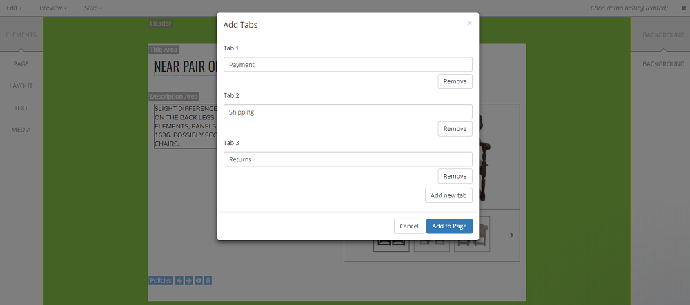
Once we’re happy with the tab settings (like the names and layout), we’ll click Save, and the Tabs widget will be added to the Policies row in the template.
Now you have a neat, organized way to display your shipping, return, and contact information—each in its own tab that customers can click through for easy access! This keeps everything looking clean and professional.

Adding a Cross Sell row to showcase other products can really boost your sales by encouraging customers to check out more of what you have to offer. Let’s add that row and place it above the tabs, but below the main listing information.
Here’s how:
- In the left menu, go to Elements > Layout and select Add Row.
- Name the new row Cross Sell to keep things clear.
- Set it as a single-column row just like before.
- Save the row, and now it’s part of your template.
Now that we have the Cross Sell row added, let’s move it to the right position. We’ll move it above the tabs (but below the product details) to maximize its visibility!
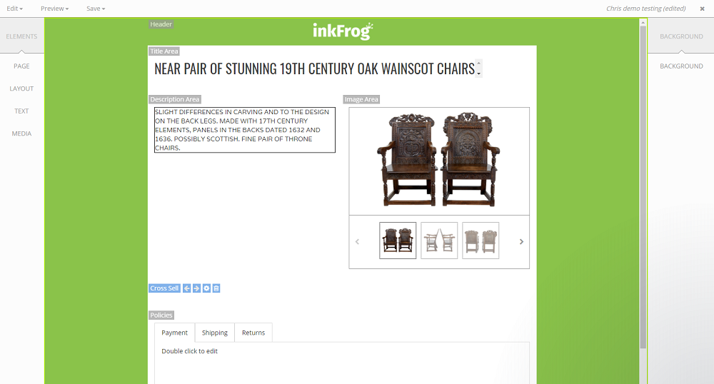
Now, to add the Cross Sell widget to the new row, follow these steps:
- In the left menu, go to Media > Cross Sell.
- This will add the Cross Sell widget to the Cross Sell row you just created.
The Cross Sell widget will allow you to feature other products from your store right on your listing, giving customers an easy way to see more of what you offer.
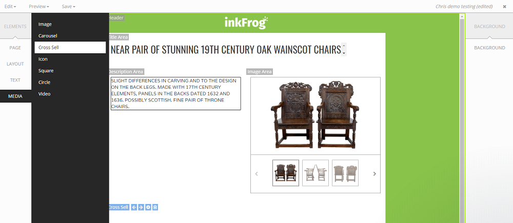
When you add the Cross Sell widget, a window will pop up to allow you to configure it to your liking. Since we're using the default settings for this demo, we don’t need to make any changes. The default settings should work great for showing related products in a neat, organized way.
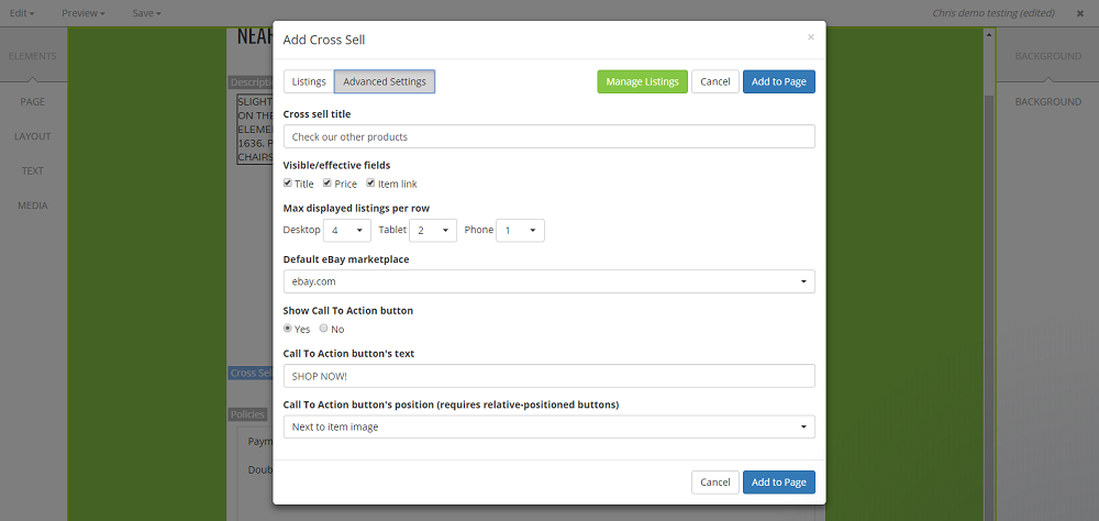
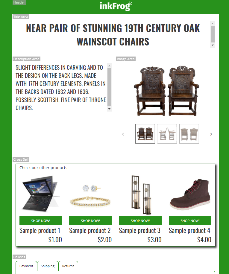
After you finish configuring the Cross Sell widget, it will be added to the template, and you’ll see some example products displayed in the widget. This lets you preview how it will look on your actual eBay listings.
These example products are placeholders, so once the template is live, it will automatically display your actual products. You can further adjust the layout, design, or the product selection later, but for now, it’s a great way to get a feel for how everything comes together.
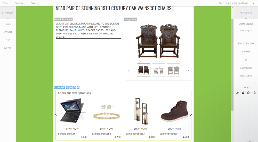
Now, to make those Call to Action buttons stand out in inkFrog green and add a bit of polish to the widget:
- Select the Cross Sell widget in the preview panel to make sure it's active.
- In the right menu, go to Component > Call to Action Buttons. This will allow you to modify the appearance of the buttons that link to your other products.
- From there, you can change the button color to inkFrog green by adjusting the color settings for the buttons.
Once you've selected the green color, the buttons will update instantly in the preview, giving them a cohesive, branded look that matches the rest of your template!
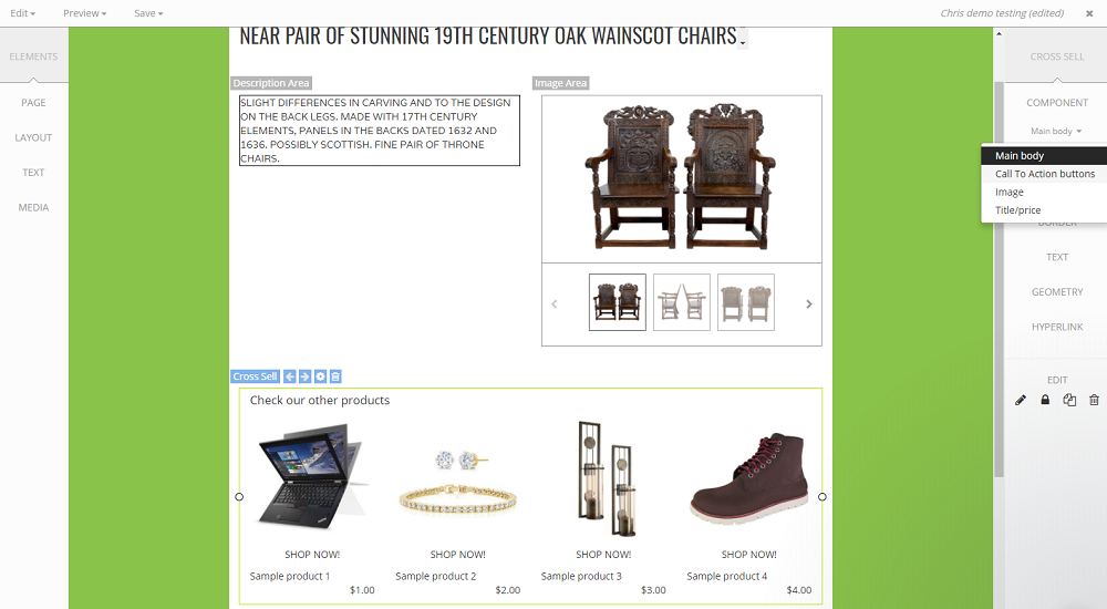
By editing the Call to Action Buttons in the Cross Sell widget, you're making them match your branding while keeping it simple.
Now that we’ve changed the button color to inkFrog green, the buttons will look more eye-catching and cohesive with the rest of your template.
This simple tweak makes a big difference in creating a polished and professional look for your listings!
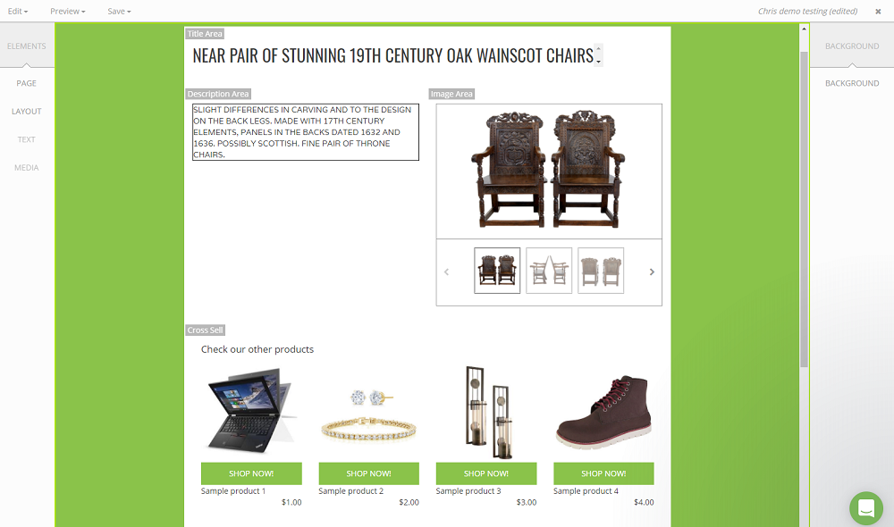
It really is incredible how something as simple as changing the color of a button can instantly elevate the look and feel of a template! Small adjustments like that can make a huge difference in how professional and polished your listings appear to customers. With the inkFrog Designer tool, the possibilities are endless, whether you're customizing colors, layouts, or adding interactive features like tabs and cross-selling widgets. The Designer tool gives you so much flexibility to really make your listings stand out!
Was this article helpful?
